Details at Every Scale
They say, “the sum is often greater than its parts.” We at Hickok Cole argue that details oftentimes lie at the heart of every project, making it that much more engaging, thoughtful, and provocative. This month, take a look at how details complete the narrative of projects at every scale.
Details on A Graphic Scale

Liberty Place at 325 7th Street, NW was an aging, 12-story office tower composed of two buildings—the historic Fireman’s Fund Building built in 1881, and an addition built in 1991. A refresh was needed to attract a growing set of contemporary tenants and to usher the building into a new era.
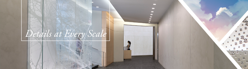
Hickok Cole Architects helped to create a new identity for the building. The architecture team employed a significant intervention to the entry, transforming it into an ultra-clean, bright and modern lobby that draws visitors in from the street and creates a clear pathway to the elevators. The transformation was achieved by carving away an unused portion of the second floor to create a soaring two-story space, matching the opening in the façade.
Like moths to a flame, the soft light of a large, contemporary glass lantern draws visitors towards the elevators.

Visitors enter the building through a minimalist glass cube vestibule beneath a canopy. Like moths to a flame, the soft light of the large, contemporary glass lantern draws visitors in toward the elevators. Hickok Cole Creative enhanced the visual identity of the glass lantern with striking graphic details, artistically sequencing varying hexagonal shapes to build a tranquil and elegant suggestion of blossoming cherry trees. The hexagon, a visual souvenir of the building’s former lobby interiors, is inspired by the motif that remains in place on the exterior façade of the building. As visitors walk closer toward the lantern, each shape reveals a clever construction from the numbers 3, 2, and 5 – the street numbers of the building address.

Click here for more information on Liberty Place.
Details on A Grand Scale
The Hepburn is a grand apartment residence adjacent to the Washington Hilton in the sophisticated D.C. neighborhood, Kalorama. A top-of-the-market rental property, The Hepburn’s branding and marketing strategy folds aesthetic intentions, historical cachet, and a high-profile resident demographic into a coherent story. Centered on an iconic surname, The Hepburn denotes classic, independent, modern and stylish without explanation. People just get it. By integrating the elements of allure, fashion advertising and an understanding of the subtleties of luxury branding, the strategy building an appropriate visual language in image, word and symbol:
…The Hepburn denotes classic, independent, modern and stylish without explanation.
Imagery
Custom photography captures figures in repose against the captivating, panoramic view from The Hepburn. Each hero figure embodies the essence of the Hepburn surname, further symbolized by an iconic object and connected to each feature of the resident living experience.

Patterns
Inspired by the building’s diagonally-laid, wide plan flooring, The Hepburn pattern adds a subtle layer of detail and texture to digital and print marketing materials – from diagonal, thin grey stripes on the back of business cars to bold, metallic rose quartz stripes on the carrier package.

Hickok Cole is passionate about design and the creative process. Every great design starts with a strong, clear, thoughtful concept, culminating in a project that tells the story of the client. Details serve to enhance this project narrative and create a lasting impression.

Click here for more information on Hickok Cole Creative and The Hepburn.